Active Brands
Designing a unifying digital layer for a multi-brand company
Project type
Webdesign
Year
2022
Client
Active Brands
My role
Design Director
Active Brands approached me to redesign their corporate website with a minimal, high-energy direction. While each portfolio brand had its own identity, the parent company lacked a cohesive digital presence. The challenge became creating a unifying system that could bring clarity and momentum to the brand ecosystem without competing with the brands themselves. Designed independently during my transition between Good Morning Naug and Club.
My Role
Lead Product & Digital Designer
Responsible for:
Creative direction
UX and interaction design
Information architecture
UI system design
Art direction
Motion principles
High-fidelity product design
The client handled development internally, so the platform was designed to be modular, lightweight, and implementation-friendly without sacrificing visual impact.
Problem
Active Brands consisted of several strong independent brands, but the parent company itself lacked a clear digital identity.
Each brand communicated well individually, yet together they felt fragmented. The existing corporate presence did little to explain the relationship between the brands, the culture behind them, or the scale of the company itself.
The challenge was creating a parent-brand experience that could unify multiple identities without flattening them into a single aesthetic.
The parent brand could not behave like another competing brand in the ecosystem.
It had to function as infrastructure.
Insight
The solution was not to create a louder identity, but a more controlled one.
Instead of relying on heavy branding or visual effects, the system used restraint to create energy. Motion, pacing, typography, spacing, and contrast became the primary tools for shaping the experience.
This allowed the portfolio brands to remain the heroes while the parent company provided structure, rhythm, and cohesion around them.
Reframing
Rather than designing a traditional corporate website, the project became about designing a connective layer between brands, culture, and business.
The goal was to make Active Brands feel less like a holding company and more like an active ecosystem.


System Design
The visual system was intentionally minimal to support scalability across multiple brands and future growth.
Consistency came from:
strong typographic hierarchy
structured spacing systems
restrained color usage
high-contrast layouts
controlled motion and pacing
modular content blocks
The energy of the experience came from rhythm and movement rather than decoration.
This created a platform that felt fast, modern, and confident without becoming visually heavy.


From System to Product
The website was designed to shift fluidly between company storytelling, brand presentation, and recruitment positioning.
The structure allowed different portfolio brands to coexist inside the same experience while maintaining their individual identities.
Each section was designed to feel editorial and intentional, helping users understand both the scale of the company and the distinctiveness of each brand underneath it.
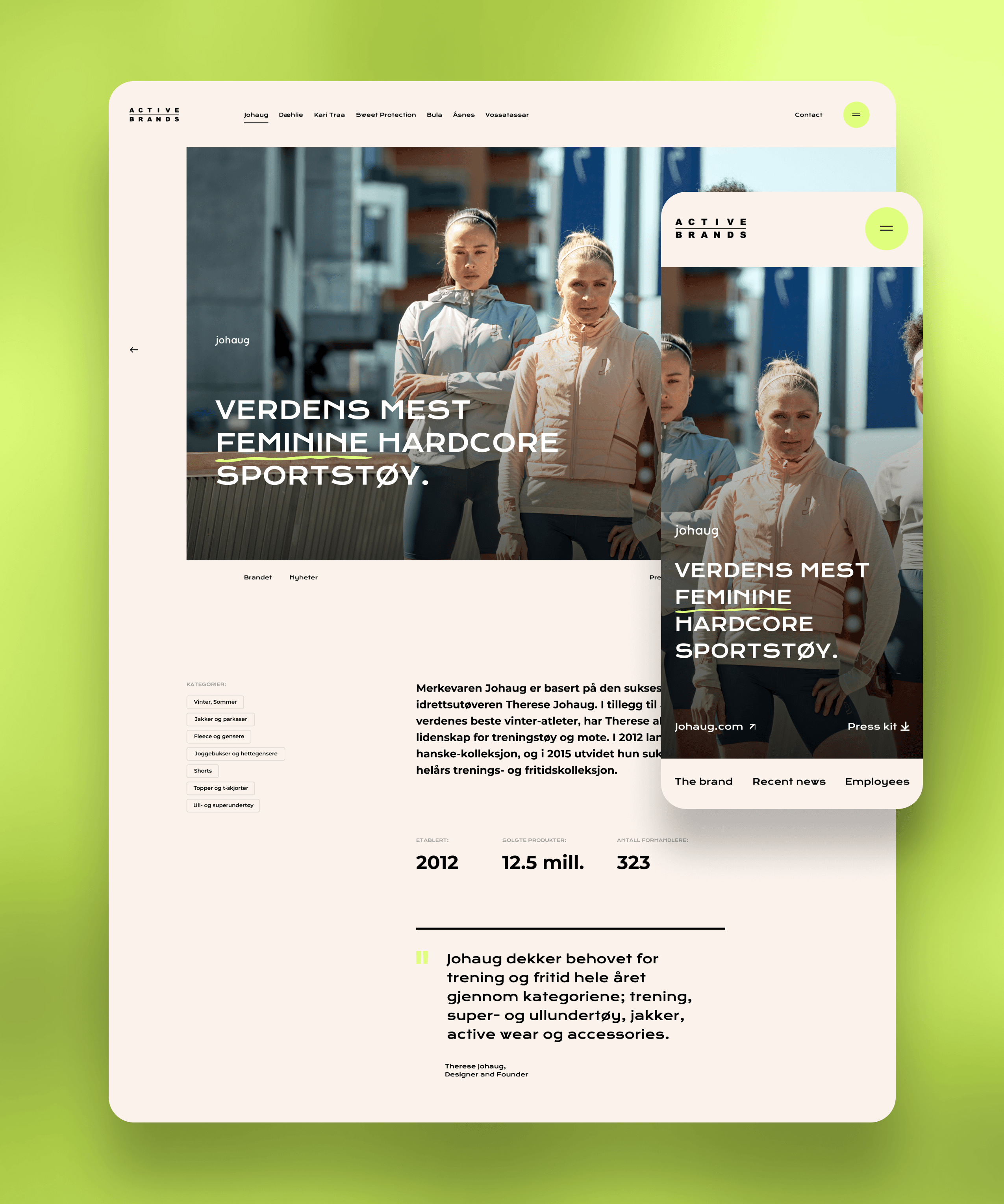

Solution — Platform
The final platform combined minimal interfaces with dynamic pacing and large-scale typography to create a modern corporate experience.
Key elements included:
modular page structures
bold editorial layouts
restrained motion design
flexible brand showcase sections
simplified navigation architecture
implementation-friendly components
The result was a system that felt expressive without relying on complexity.


User Experience
The experience was designed to feel direct, fast, and lightweight.
Large typography and generous spacing created clarity, while transitions and pacing introduced momentum throughout the journey.
Instead of overwhelming users with information, the platform focused on creating a strong sense of movement, confidence, and structure.


Impact
The redesign gave Active Brands a clearer parent-brand presence capable of supporting both company storytelling and portfolio positioning.
The platform created:
stronger cohesion across brands
clearer communication of company identity
a more modern and scalable digital foundation
improved alignment between business and brand presentation
Most importantly, it established a digital framework flexible enough to evolve alongside the company itself.


Key Insight
Strong systems do not always need stronger branding.
Sometimes the role of design is to create enough structure for other brands, stories, and identities to perform at their best.


