Club Branding
Creating community gravity
Project type
Brand Identity
Year
2024-2026
Client
Club
My role
Brand Designer — Identity System
Brandbassador helped brands manage ambassadors. But the market had changed. It became fragmented, feature-driven, and indistinguishable, while consumers grew indifferent to traditional marketing. At the same time, the platform was being rebuilt from the ground up. This created an opportunity to redefine what it is. Club.co shifts marketing from campaigns to community —a system for growth built on participation, not promotion.
My role
I translated the strategy into a scalable identity system.
I shaped the core concept of the symbol —
a wand transforming into a funnel, leading to a central star —
and constructed it using golden ratio geometry.
Problem
The category was saturated.
Platforms competed on features.
Messaging was generic.
Brands struggled to differentiate
At the same time:
consumers ignored traditional media
influencer models felt transactional
The industry optimized reach.
It failed to build connection.
Insight
Transactional relationships don’t compound.
Communities do.
People don’t want to be managed.
They want to belong.
This wasn’t a better tool.
It was a different model.
Reframing
From:
Managing ambassadors
To:
Creating community gravity
Club.co exists to create community gravity —
where people don’t get recruited, they join.


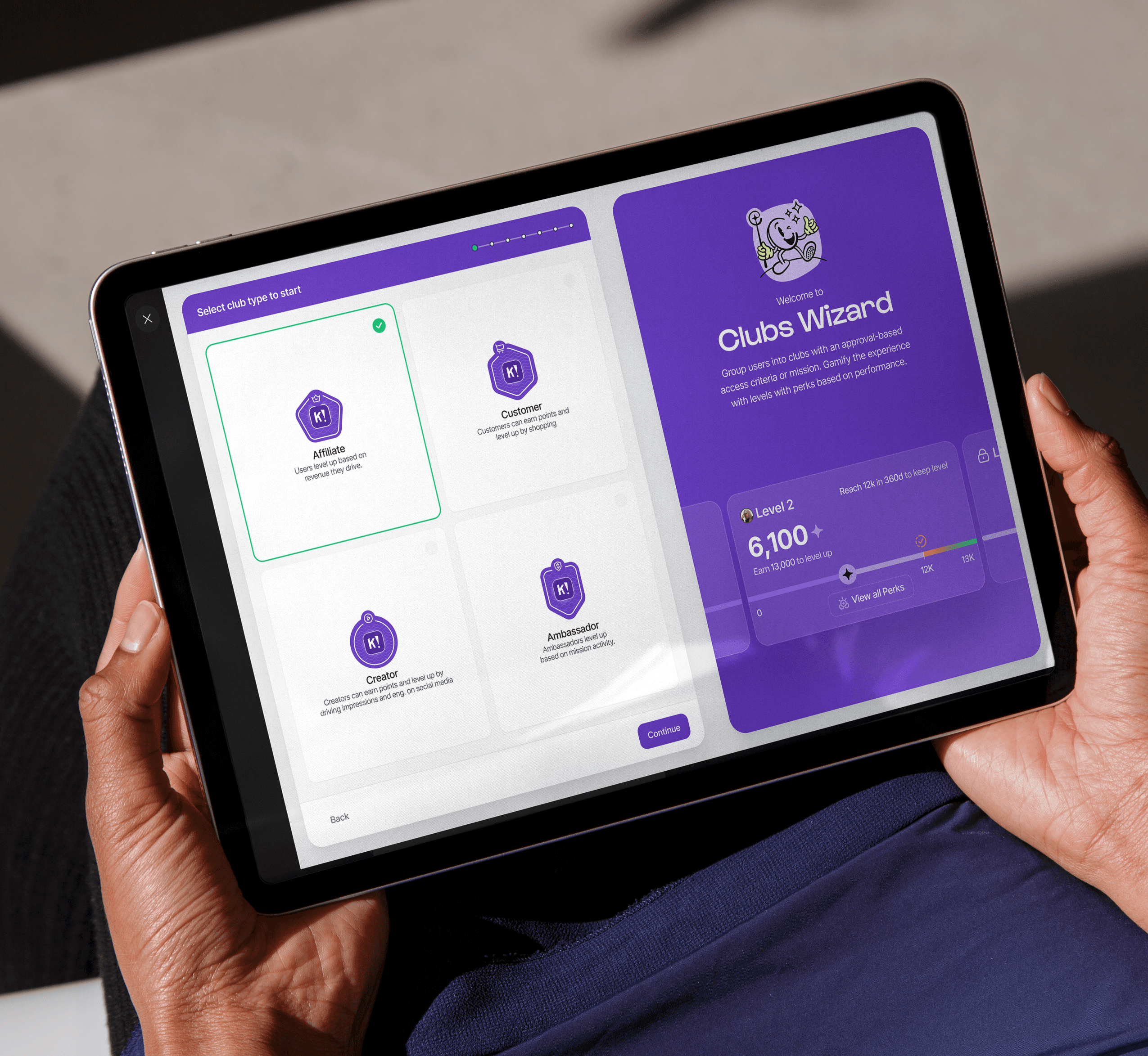
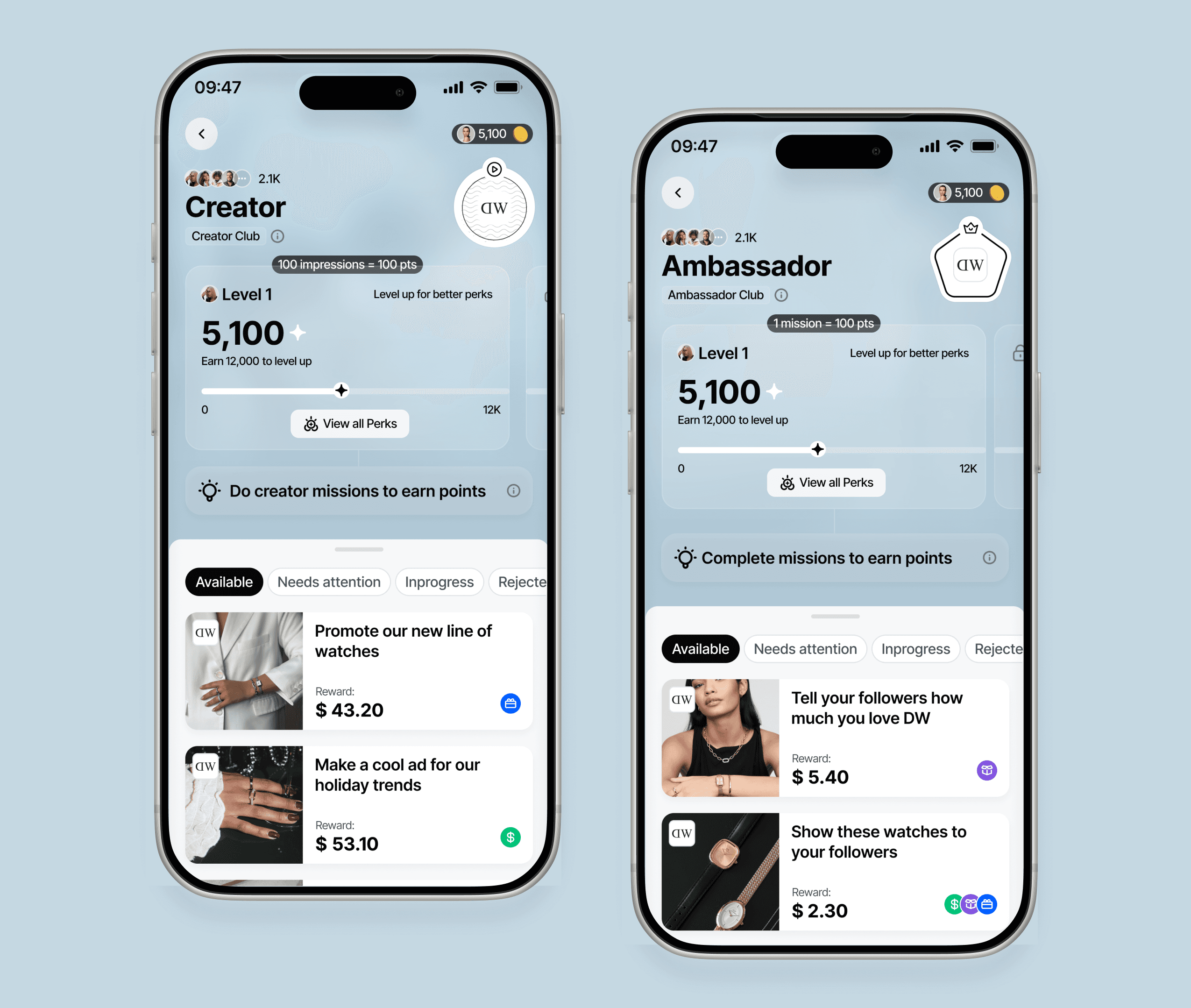
System
The mark is not a logo.
It’s a model.
A wand that becomes a funnel.
A funnel that leads inward.
At the center: a star.
The community.
This is where the magic happens.
People don’t get pushed.
They move toward a center.


Designed to hold together
The symbol and wordmark are built to work as one.
Whether stacked or aligned horizontally, the relationship stays balanced—clear, flexible, and consistent across contexts.

More than one expression
The identity isn’t fixed.
By inverting colors and shifting contrast, the mark becomes more playful—adapting to different moods while staying recognizable.
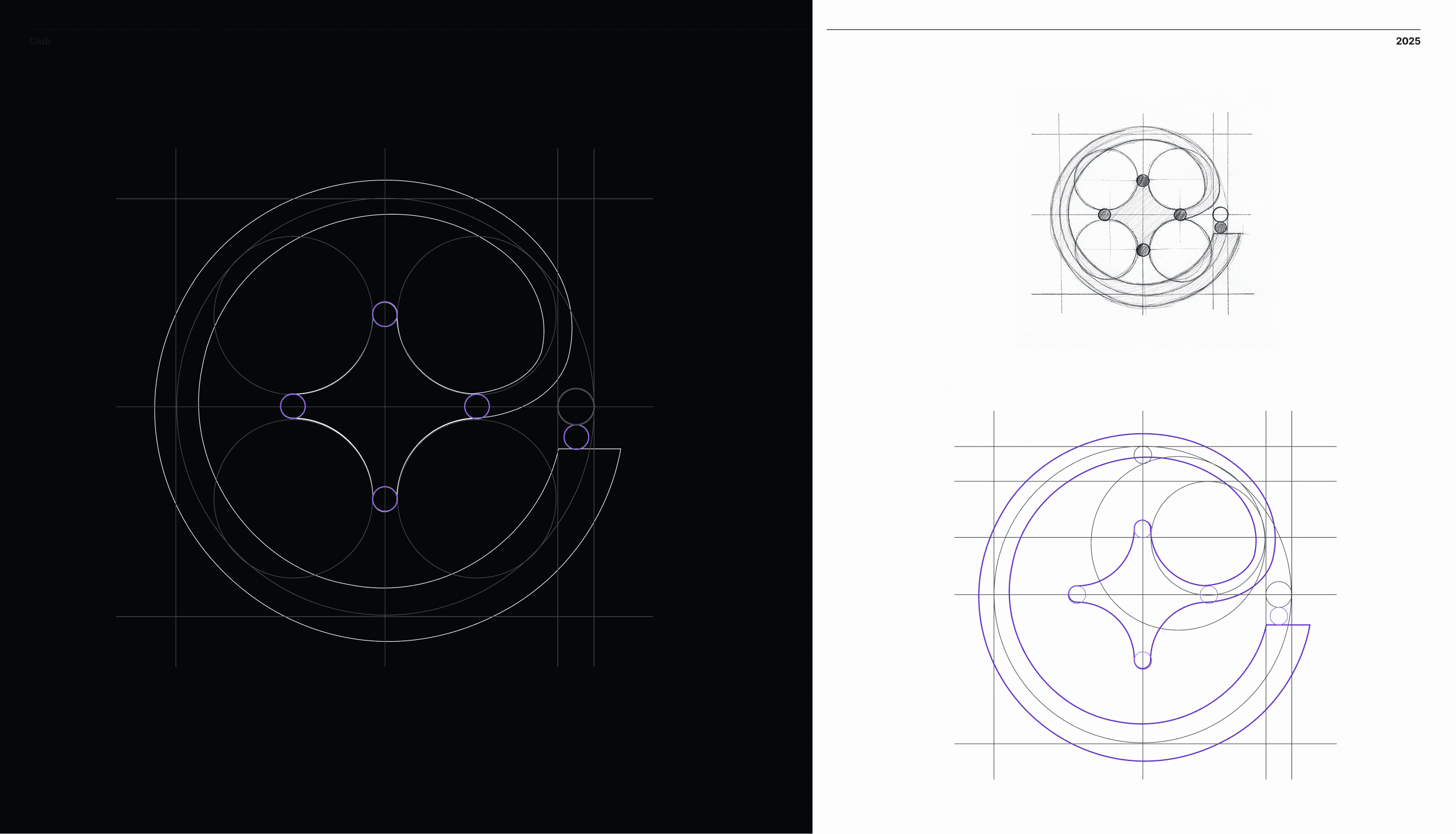
Constructed with intent
The logo is built on the golden ratio, using precise geometry to create balance, harmony, and flow.
Every curve and intersection follows a system, ensuring the mark feels both natural and exact.

The Overall Experience
Not a tool.
A system in motion.
Immediate. Social. Alive.
You don’t get assigned.
You arrive.
Primary & Secondary Colors
Primary colors define the brand—bold and unmistakable. Purple anchors the identity as a symbol of magic and creativity. Secondary colors add contrast and flexibility, while black and white logos step back when color needs to lead.

Impact
The rebrand and rebuild worked as one.
It didn’t change the product.
It made its value obvious.
From pushing people through funnels
to creating something they move toward
From acquiring users
to attracting members

Key Insight
The future of marketing is not distribution.
It’s gravity.